Make Textures Speak With Light

Step into a hands-on exploration of lighting techniques that accentuate surface textures, turning quiet materials into expressive storytellers. We will experiment with angles, modifiers, color, and contrast to reveal ridges, pores, and grain. Expect practical setups, field-tested tips, and encouraging prompts to try, share, and refine your own results alongside this creative journey.

Angles That Reveal What Touch Feels Like

Direction changes everything: when light grazes at a low angle, tiny bumps become mountains and shallow furrows turn into rivers. Understanding how raking, cross, and rim directions sculpt micro-relief lets you control sensation, not just illumination. We will measure, observe reflections, and iteratively adjust until photographs transmit the same tactile intrigue your fingers would discover in the dark.

Shaping With Modifiers, From Soft Glow to Hard Sparkle

Modifiers are chisels for light. Big sources spread gentle clarity that caresses texture, while small, punchy sources deliver bright specular accents that make fine details snap. Grids, snoots, and barn doors confine spill and guide attention. Feathering adds control without harshness. By mixing sizes, distances, and edges, you decide how boldly or subtly the surface should speak.

Mastering Contrast and Shadow Depth

Texture thrives on separation between peaks and valleys, yet too much contrast erases nuance. Balancing light ratio, reflective fill, and negative fill shapes believable dimension. Study the histogram, but trust your eyes on midtone roll-off. Subtle reflectors and flags let you nudge shadows open or close, protecting the sense of depth while avoiding cartoonish, brittle extremes.

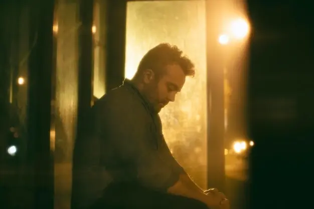
Negative Fill to Deepen Valleys

Place black foam core, flags, or a dark curtain near shadowed areas to absorb stray light, making grooves read deeper without increasing overall exposure. This is especially powerful in small studios where bounce contamination is common. Adjust proximity for strength, and watch how delicately darkened recesses enhance form while preserving midtone texture that keeps surfaces feeling honest and touchable.

Controlled Bounce to Lift Without Flattening

A small white card, silver card, or subtly diffused panel can float into the scene to rescue blocked shadows without steamrolling contour. Keep the bounce small, angled, and distant enough to remain gentle. On rough textiles or stone, this preserves dimensional cues while improving readability. The result is nuanced detail where viewers sense depth and still enjoy inviting contrast.

Bracket and Blend When Range Is Brutal

If the dynamic range outpaces your lighting control, bracket exposures and blend carefully. Prioritize highlight texture in one frame, shadow nuance in another, and marry them with restraint. Preserve natural falloff and avoid halo artifacts by masking thoughtfully. The goal is believable presence, where every pore or groove feels authentic and nothing screams software trickery, only deliberate, crafted illumination.

Cross‑Polarization to Tame Glare, Then Selectively Release It

Place a linear polarizing film on your light and a circular polarizer on your lens, then rotate to dial out specular glare on varnishes, glazes, or polished woods. Once detail emerges, ease the effect to reintroduce just enough sparkle. This controlled reveal keeps textures legible while preserving lifelike highlights, balancing scientific precision with the emotional honesty that highlights deserve.

Warm–Cool Separation That Makes Ridges Pop

Introduce a warm key and a cool accent, or vice versa, so peaks catch one hue and valleys receive the other. The chromatic contrast amplifies dimensional perception without relying solely on brightness differences. It works beautifully on carved wood, linen folds, and architectural stone. Keep saturation modest and maintain white balance discipline to avoid gimmicks, prioritizing believable, story-supporting color interplay.

Respecting Material Signatures: Wood, Metal, Fabric, Ceramics

Every surface family carries expectations. Wood appreciates directional warmth and gentle specular control. Metals prefer clean, deliberate reflections shaped like designed gradients. Fabrics respond to feathered softness that preserves weave. Ceramics toggle between glaze sheen and clay texture. Study test swatches, photograph reference spheres, and refine until the lighting honors identity, letting viewers feel authenticity before noticing technique at all.

Practical Setups for Products, Food, and Architecture

Real scenes demand nimble kits. From a single light with foam core to multi-source rigs, the goal is repeatable texture control under time pressure. We will map step-by-step placements, intensities, and modifiers for everyday challenges. Expect concise checklists, small-space workarounds, and field wisdom gathered while photographing weathered wood shelves, crusty breads, leather goods, and century-old brick walls that tell stories.

Workflow, Experimentation, and Story

Great texture work is iterative. Tether when possible, annotate setups, and change one variable at a time. Build a reference library of swatches lit from different angles and with distinct modifiers. Seek feedback, revisit scenes, and embrace happy accidents. Ultimately, technique serves narrative: let the surface history, function, and context decide how boldly your lighting should speak.
Faritelizavo
Privacy Overview

This website uses cookies so that we can provide you with the best user experience possible. Cookie information is stored in your browser and performs functions such as recognising you when you return to our website and helping our team to understand which sections of the website you find most interesting and useful.